Axiology
Optimized UX and re-designed homepage and product page that increase product conversion by 15%

Quick Summary
Axiology is a sustainable and vegan beauty brand. They are best known for their Balmie vegan lipsticks made with natural ingredients and zero waste packaging. Ericka, Axiology founder, and their team are eager to improve and optimize their website. As a growing company, Axiology is ready to revamp its shopping experience to the next level.
I helped Axiology redesign their store, optimize store experience, and increase conversion rate.
Live site: axiologybeauty.com
-
Total revenue increased by 20% in first 3 months
48% of came from subscription and cross-sell
Product conversion rate increased by 15%
-
Design Lead
Project owner from discovery, to design, to launch.
Led the interactions design and experience
Created optimization strategy by introducing subscription model & upsell strategies.
Identifying main pain point(s)
In the research phase, some of the main pain points, identified by the Axiology marketing team, were low engagement on the homepage and product page. Their customer base is always searching for information on product ingredients and how the products are made, and they are overwhelmed by the way the content is structured on the product page. As a result, ignoring the content as a whole and leaving the page before checkout. In terms of the homepage, there was confusion on certain sections of the page, such as unclear feature categories and a lack of education on their products and benefits.
Re-Defining User Experience (IA and Wireframe)
When approaching the design, I started with outlining the information architecture in identifying what, how, and where content is structured for each page with the intention of solving some of the challenges outlined above, while considering what Axiology have currently on their site. This includes adding and removing sections and features that would best improve the user experience. Once this is established, a low-fi wireframe is sketched and created on Figma that would visualize potentially how each section would look like, how long the content should be, and new features.
With the wireframe established, I move towards designing hi-fi designs. Following Axiology’s brand guidelines, I created a set of new and refined design systems (typography, color, buttons, and more). The goal for this is to ensure that there is proper documentation for development and can be reused for future optimization.
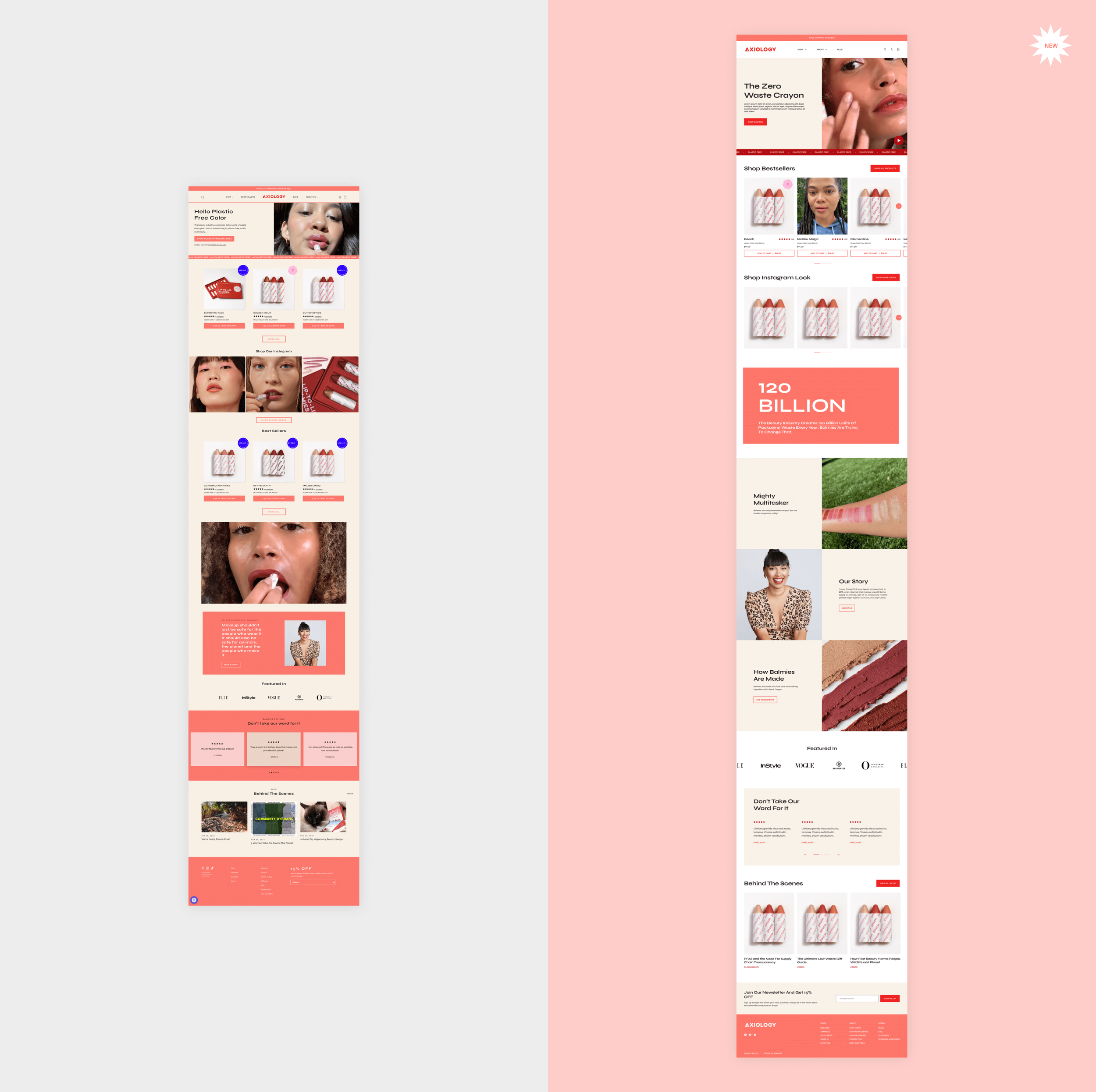
New and Improved Design
The new design uses whitespace and color-blocking to help provide contrast from section to section. Much of the content is refined and reduced to a digestible length that is short, concise, and impactful. Here are some of the design and feature highlights.
Homepage
New color (red) is used on main CTAs: higher contrast and visibility.
Carousel functionality on their feature categories section: increase the number of products to 6, this helps with upselling more products.
Shop Bestsellers & Shop Instagram Look: grouped together in association and highlight bestsellers as the first collection to be seen by customers.
Hero text banner: highlight company goals and vision
New content blocks (Text/image): highlights benefits, company story, and how it’s made.


Product Display Page
Re-structured product gallery: Introduction to size variant, quantity field, and information tabs (allow to store all necessary information without being too overwhelming).
Benefit icon section: enhances product validation
New content blocks (Text/image): highlights product benefits
Review App: Re-designed the section to be more aligned with brand identity
New hero banner section: promotes education and Axiology’s blog


Navigation and Footer
Main Navigation: simplified navigation and grouping of links (logo, navigation, cart/logins) using a white background for better contrast.
Shop dropdown: simplified to 2 categories (Collection and Colors) and “Shop All” is visible under both collections. There’s also a new image banner embedded in the dropdown that promotes samples with CTA to shop samples
Newsletter: Standalone section for better visibility.
Footer: restructure categories so that is easy to find product/collections and company information.

