Mutha
Designing a conversion-focused UX for a luxury wellness brand

Quick Summary
Mutha is a beauty brand on a mission to empower and give confidence to women with its wide range of high-quality beauty products. Mutha’s goal is to grow the brand, optimize their store experience, and increase revenue & customer acquisition.
I helped Mutha optimize their web & mobile navigation and product page conversion.
Live site: mutha.com
-
Total revenue increased by 26% in first 3 months
62% of came from subscription and cross-sell
Product conversion rate increased by 18%
-
Design Lead
Project owner from discovery, to design, to launch.
Led the interactions design and experience
Created optimization strategy by introducing subscription model & upsell strategies.
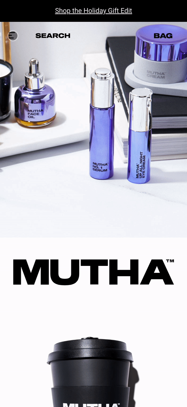
The problem: Busy Navigation
During the discovery and research phase, we were able to dive into some of their analytics in order to understand how the customer is navigating their store. We identified users spends a lot of time in the navigation. This is evident in the current navigation. It requires a lot of clicks (action) to look for links. As a result, it leaves users spending a lot of time on the menu looking for information and discourages exploration on other pages (resulting higher bounce rate). This is especially true for the mobile version.
On the desktop version, there were also legibility issues in the text links in the main navigation. It is clashing with the image below, which makes it hard to locate the menu. In addition, the menu is not sticky (when you scroll, it doesn’t stick on the top of the site), which increase the amount of time the user have spend to look for information.

New Navigation: Simple and effective
While the initial design is bold and definitely stand out, the navigation isn’t as user friendly as some of the traditional navigation style, this is especially true for e-commerce (Jacobs Law). A cleaner grouping (logo, navigation links, and carts) using combination of text and icons is simple and effective, especially the purpose of the navigation is to location information, fast. Here are some of the main changes
Vertical dropdown: easier to read and digest information
Shop All: allow user to easily find all the products/collection
Sticky Navigation: this feature allows for better accessibility without having to constantly scrolling back to top

Original
As seen above, each of the link slides to a new page. When looking for information and links, the user will always have to alternate between pages, which can be an unpleasant experience.
New
The simplified version of the menu reduces clutter (arrows), have clear dividers, and reduces the steps it takes to locate information by displaying information with vertical hierarchy using drop down feature.
Product Page: Content Overload (challenge)
Based on their analytics and insights, much of the content on the product page aren’t being read by the user due to its long length. This also caused issue for mobile version of the page as it became extremely long to scroll, which had a negative effect on locating necessary information and product validation before checkout (abandon carts). This is a main concern as most of their existing traffic came from mobile users. As such, the main challenge(s) is to decrease page length, revise content structure, and optimize design for mobile.

New, Simplified, Product Page (Solution)
Following their existing brand guidelines and design systems, the new design greatly reduces the page length while still being informative with content that drives sales. Here are some some of the main highlights:
PDP (Desktop): page length reduced 40%
PDP (mobile): Page length reduced 50%
Product gallery: left (image) to right (content) orientation for better association and legibility
Size variant: helps with product organization and allow user to know other sizes available
Review section: a clear carousel section that showcases the reviews, which was embedded as a image and hidden in the original design
Cross-sell: module increased to 3 to help with upselling products in related categories
Newsletter: standalone section to encourage customer to sign up for subscriber discounts
Footer: streamlined categories for better accessibility


Original
Static “Add to Bag” CTA and quantity field with awkward orientation

New
The new cart is designed with a high accent color, better orientation (quantity field on the left), and is sticky when scrolling on mobile (easy access), which helps with cart conversion.
