EQ Bank: Notice Savings Account
Reframing investment UX into a flexible, everyday savings experience — driving 300% deposit growth and 50,000+ new customers
EQ Bank, a Schedule I digital bank in Canada, launched in 2016 and has since amassed over $9 billion in deposits, serving more than 500,000 customers as of OCT 2024. Recognized as Canada's leading bank, EQ Bank secured the #1 position on Forbes' World's Best Banks list in 2024, a title it has held since 2021.
Overview
EQ Bank wanted to reduce rate-chasing and customer churn by offering a smarter savings alternative. The original concept was a Cashable GIC — but I led a strategic design pivot to reposition it as a simple, everyday savings account with built-in saving discipline.
The result was the Notice Savings Account (NSA) — a flexible, high-interest savings product that required customers to give 10 or 30 days’ notice before withdrawing. By shifting the product narrative and designing a frictionless, trust-building experience, we helped create one of EQ’s most successful product launches.
My Role
Title: Senior Product Designer (Lead for this product)
Team: Product, Engineering, Legal, Compliance, Marketing, Analytics
Scope: Discovery → Product Strategy → UX/UI Design → Prototyping → Handoff
Timeline: 5 months
Tools: Figma, UserTesting, Miro, Jira, Confluence
I owned the full experience from early research and concept validation to final UI, stakeholder alignment, and launch support. I partnered closely with product leadership and cross-functional teams to ensure the design met both business and regulatory requirements — without compromising user clarity.
The Challenge
Business Needs
EQ Bank was experiencing churn from rate-sensitive savers who deposited only during promotional rate windows. Traditional GICs offered retention, but felt rigid and out of sync with the expectations of modern users. Leadership aimed to grow deposits with a product that rewarded commitment, but preserved flexibility — all while aligning with EQ’s positioning as a digital-first, everyday bank.
Reduce attrition from promotional rate chasers
Increase long-term deposits without using locked-in GICs
Deliver a savings product that felt flexible, modern, and trustworthy
User Pain Points
Early research and testing showed that the “Cashable GIC” framing caused confusion and hesitation among core users. While the product mechanics offered flexibility, the mental model and language didn’t — most users viewed it as an investment product, not a savings tool.
The term “GIC” felt rigid and intimidating, especially to non-investors
Users misunderstood the product, assuming it required investment expertise
The withdrawal rules were unclear, creating hesitation and limiting confidence in the product
Reframing the Product Strategy
The business originally aimed to launch a Cashable GIC to attract investment-savvy users — a profitable but niche segment. But after reviewing internal data, I saw that roughly 60% of our customer base were everyday savers with limited investment experience.
While both a Cashable GIC and a reimagined savings product could technically solve the deposit growth problem, the framing made all the difference. The GIC model didn’t resonate with our broader audience. Reframing it as an everyday savings tool made it more accessible — and opened the door to a much larger growth opportunity.
I proposed:
“What if we kept the mechanics of a GIC, but presented it as a smart, everyday savings account instead?”
This became a strategic, data-informed pivot. I shared customer insights and market context with stakeholders, illustrating how the reframe could unlock greater adoption and align with EQ’s long-term mission. After a series of collaborative workshops, we aligned on a new direction — one that prioritized clarity, trust, and accessibility, without sacrificing business goals.

Discovery Insights
I created a lightweight prototype and custom questionnaire to test early flows and language. User feedback was clear: the onboarding felt intuitive, but confusion still lingered around why “notice” was required.
One user asked:
“Why do I need to give notice? Can’t I just transfer it out?”
That moment reframed our challenge — we weren’t just designing a flow; we were shaping expectations and behavior.
It became clear we needed to help users not only understand the 'notice' mechanic but feel good about it. Instead of presenting it as a limitation, we repositioned notice as a feature that supported mindful saving — a small delay that encouraged better habits, not frustration. This shift informed every design decision that followed, from language to interaction models.

Design Execution
The UX strategy was grounded in behavioral and cognitive principles. I focused on reducing cognitive load using Hick’s Law — minimizing decision friction by simplifying the notice period selection and structuring information progressively. Users didn’t just need to learn how the product worked — they needed to feel confident that it worked for them. By leaning into simplification, default bias, and guided action, we made the experience feel approachable, not complex.
As we moved into high-fidelity UI design, I focused on reinforcing user trust and clarity at every touchpoint — particularly in moments that involved delayed access to funds. Rather than designing features in isolation, I built a coherent system around the user’s mental model of "saving now, accessing later."
To build trust and make the experience more accessible, we translated key user pain points into targeted UX decisions that aligned with our strategic product direction. We:
Reframed investment-like language with a savings-first tone and intuitive day-based notice options
Addressed confusion around payout rules with an interactive interest selector and real-time feedback
Tackled lack of trust by introducing clear, progressive disclosure and a low-friction screen flow


Key Design Principles
Through each step of the experience, I focused on building confidence and clarity — especially for users unfamiliar with delayed-access financial products. These principles weren’t just about usability; they helped shift mental models and build trust in a new savings behavior.
Explain before commit: The product opening flow prioritized education about the notice periods upfront. I structured this using a two-tier CTA model ("Choose your notice period" → "Get started") with embedded interest-rate comparison.
Make waiting feel secure: The withdrawal flow showed exactly when funds would be released, using a timeline-like visual and plain language labels ("Your money arrives on May 30").
Support reversal with ease: We gave users the ability to cancel pending withdrawals easily — visible in the dashboard with clear indicators.
Design with constraint clarity: A minimalist dashboard displayed current balance, interest rate, and pending activity, reducing cognitive load.
These weren’t just UX wins — they encouraged saving without anxiety, reinforcing the product’s core promise.

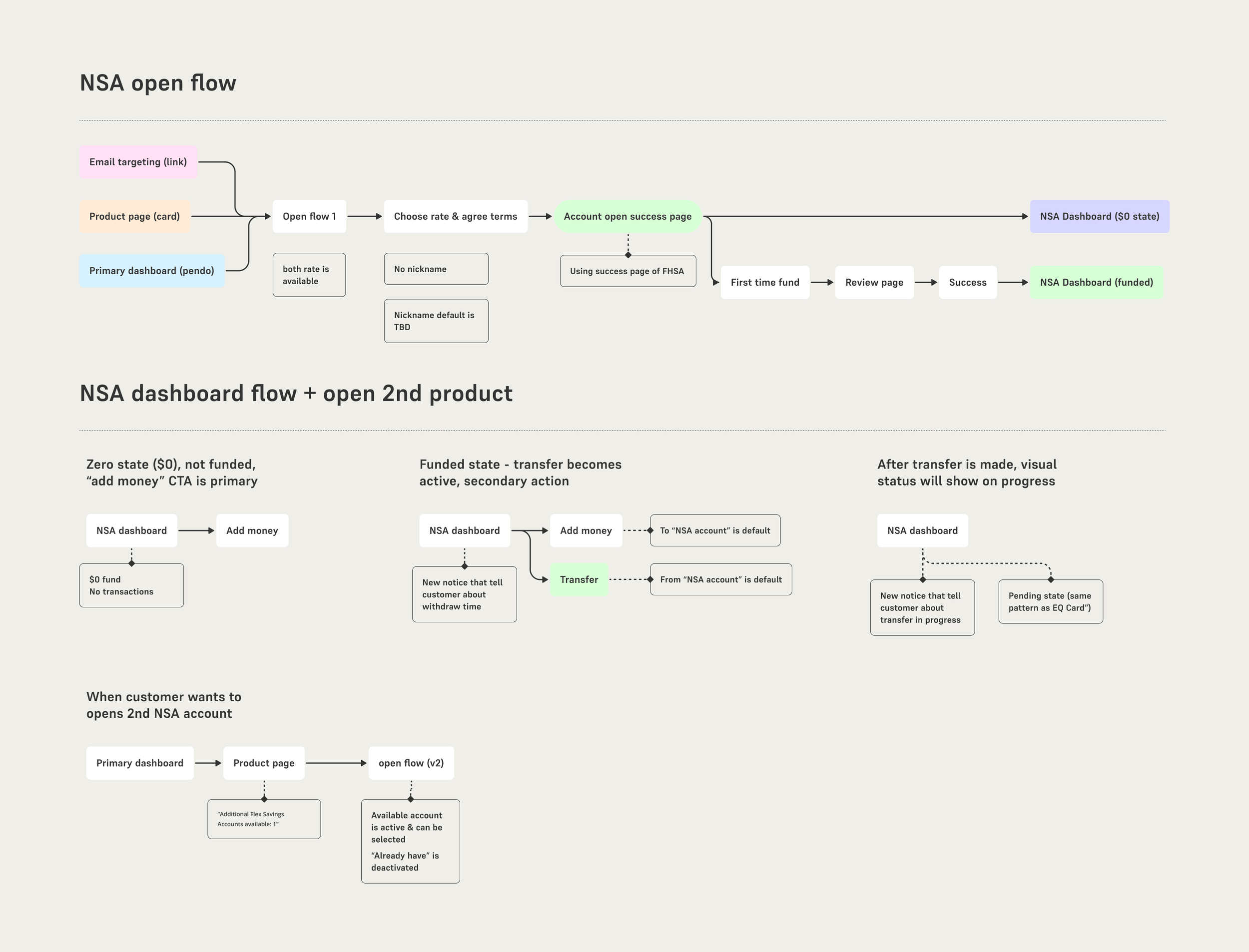
Design Snapshots
These flows weren’t just screens — they were built to reinforce the core behavior shift. Each interaction was designed to feel approachable and predictable, helping users build confidence in a product model they’d likely never seen before.
We translated these principles into a series of intuitive, trust-building flows:
Notice Period Selector: A toggle-based interface showing rate impacts in real time.
Withdrawal Timeline: A visual breakdown of when funds would be released.
Activity Dashboard: A clean summary of pending actions, designed for peace of mind.

Easy and fast open process (2 steps) with simplified account dashboard
Easy withdrawal process (with expected arrival date) and ability to cancel
Outcomes & Impact
The NSA launch demonstrated significant success in meeting both user needs and business objectives:
125% of target adoption rate in first quarter
320% ($850M) increase in stable deposit base within 6 months
96% customer satisfaction rating based on post-launch surveys
20% increase in average account balance compared to standard savings accounts
Contributed to meeting 9 billion milestone and reaching 500,000 customers
“The Notice Savings Account, launched mid-year, continues to act as a significant customer and deposit growth driver for EQ Bank, deepening its everyday bank value proposition” - F4 2024 earning. Read F4 2024 earnings report

User behavioral insights & learnings
Customer behavior analysis reveals an impressive 97% of users funding their accounts immediately (within 0 days), indicating excellent comprehension of the product's features and benefits. This level of understanding and quick adoption is particularly noteworthy for a novel financial product in the market.
There are 2x more customers who have 30 day NSA vs 10 day NSA, suggesting that customers are comfortable with locking away their money for longer period of time to get extra interest earnings.
Within first year, only 5% user initiated and successfully withdrawn from the account, which suggests that people are using the account as a long term saving product and fulfils the product primary intention.


